HYDRASENSE
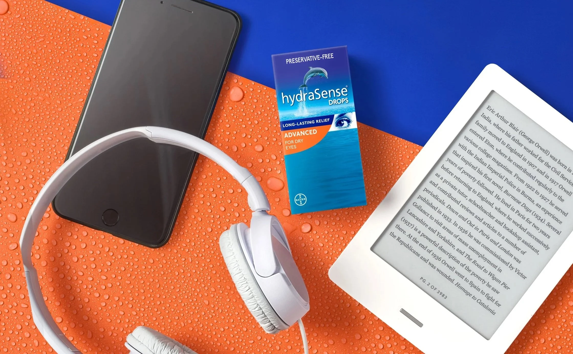
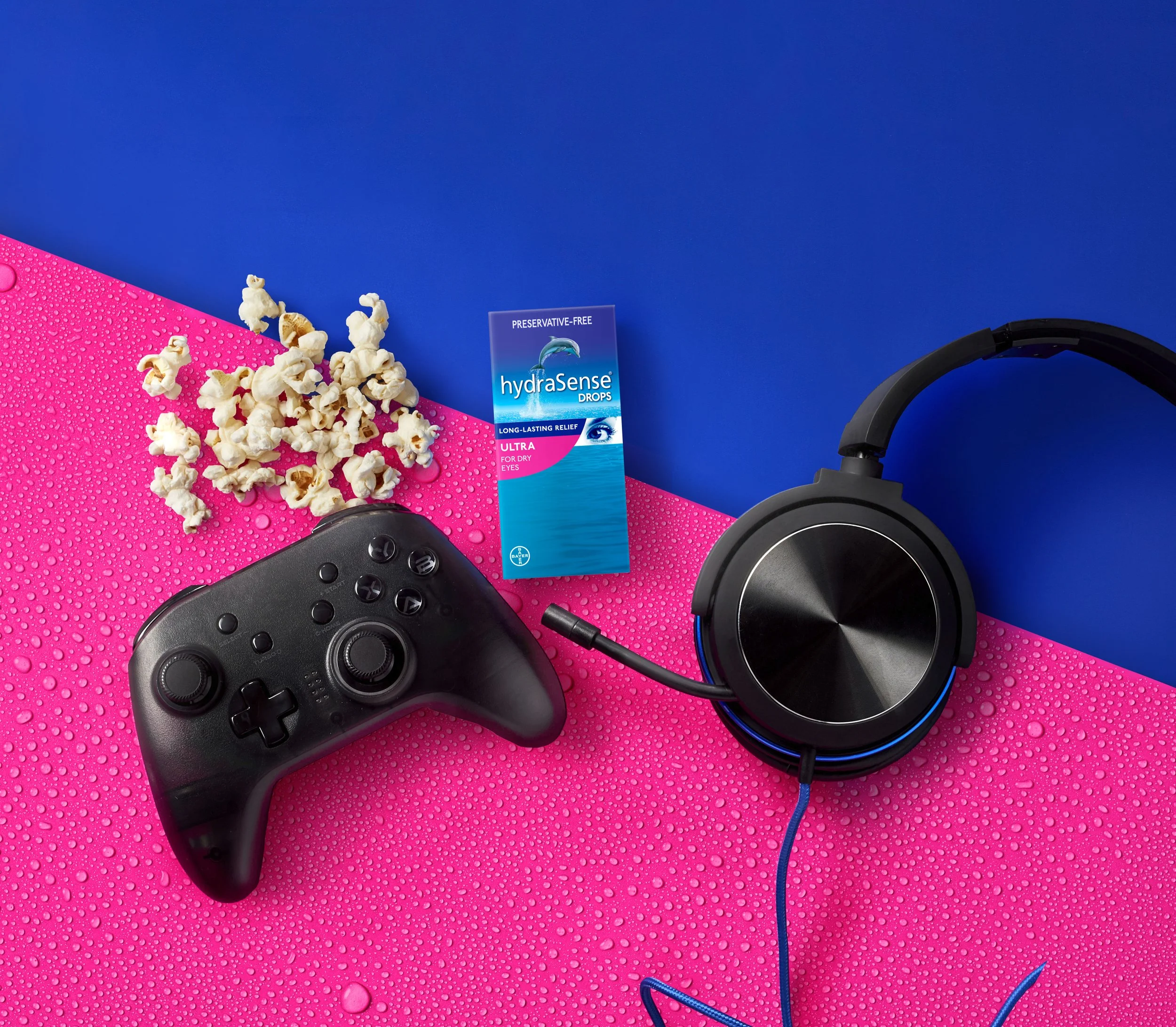
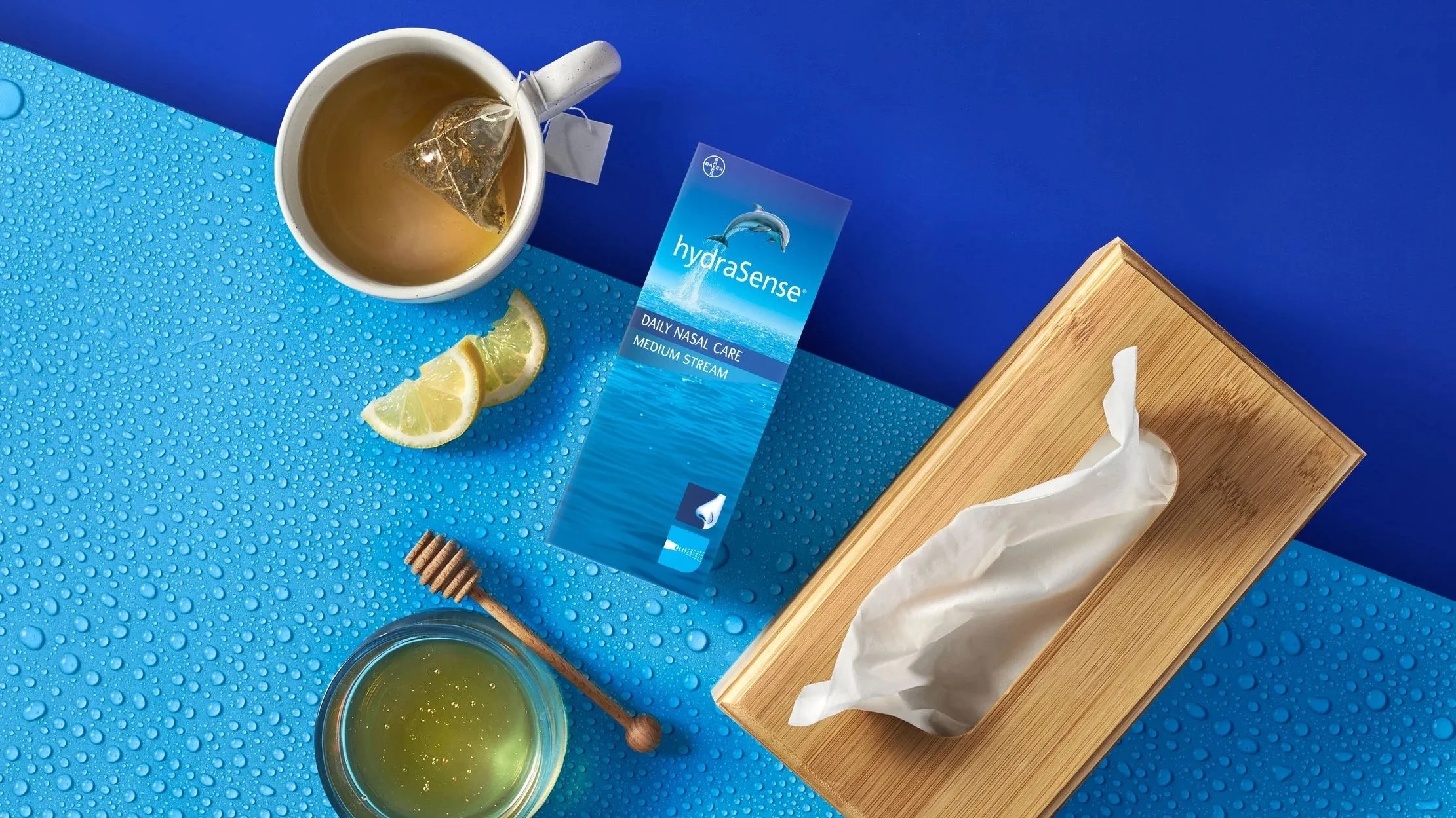
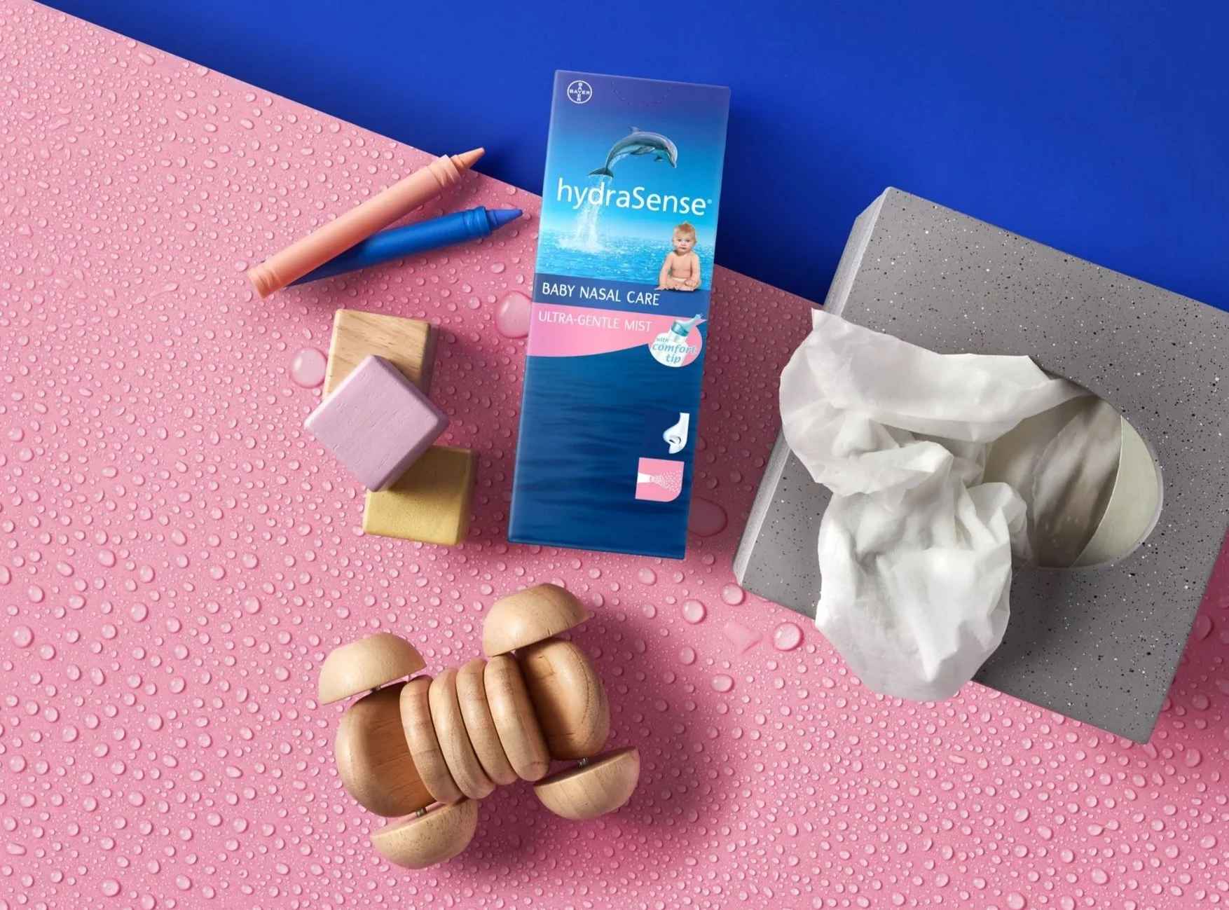
From white backgrounds to ocean clarity. We moved hydraSense off the clinical white page into a modern, graphic brand language that celebrates its saline science and prepares the brand for a unified, buildable masterbrand system.
Agency: Oliver Agency
CD: Hayley Collins
Executive Producer: Ali Watson
Director: Kari Hollend
Client: hydraSense
Peeled back to the science of the sea.
hydraSense was a well‑loved Canadian brand operating with a fragmented and dated visual language. To remain relevant and more effectively serve distinct consumer needs the brand required a modern, consistent digital and visual system. hydraSense’s differentiator is its saline science— a simple, natural efficacy that felt buried beneath clinical white backgrounds and inconsistent executions. Revealing that science in a contemporary way would both elevate perception and create flexible assets for varied retail and digital contexts.
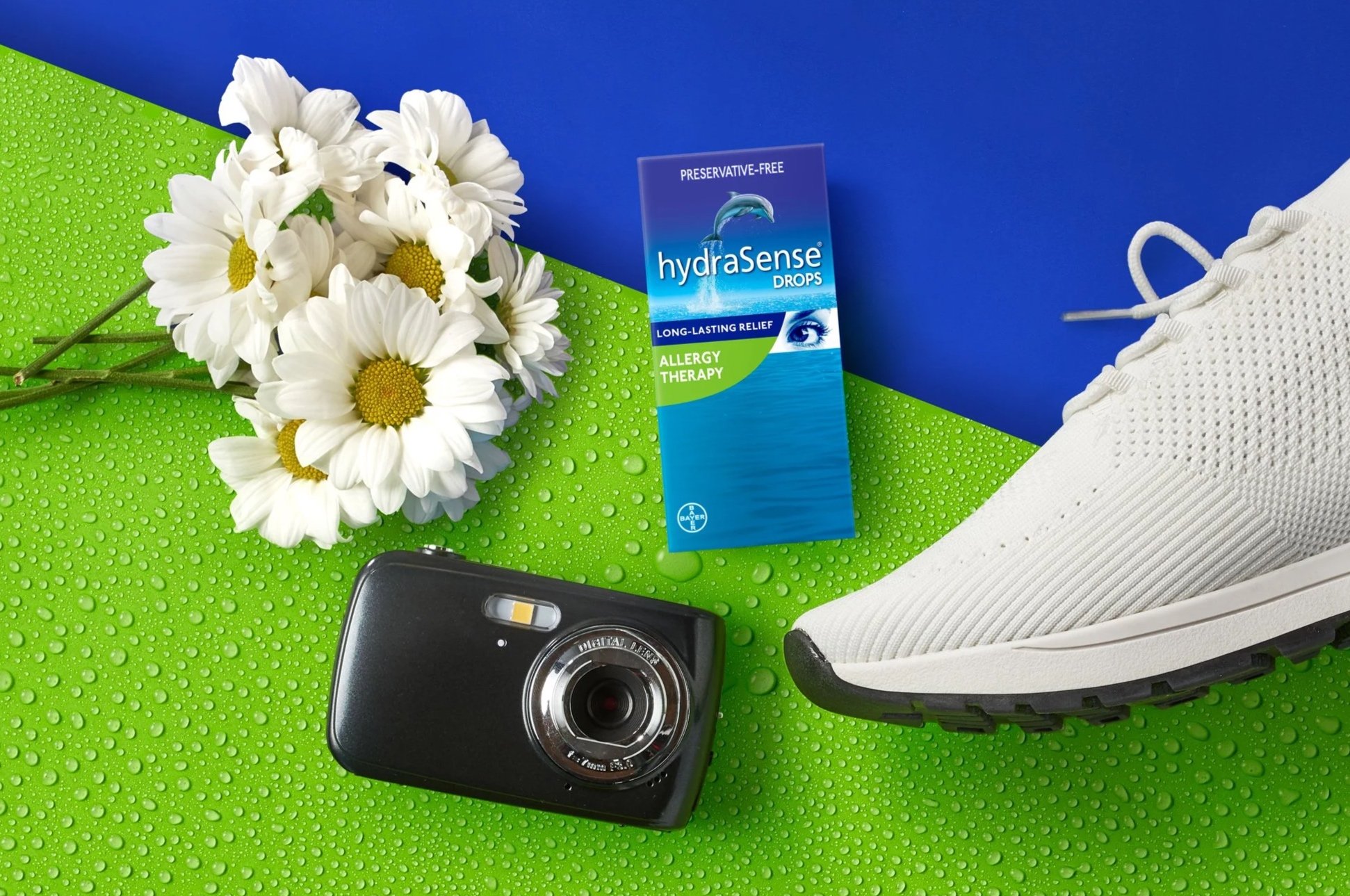
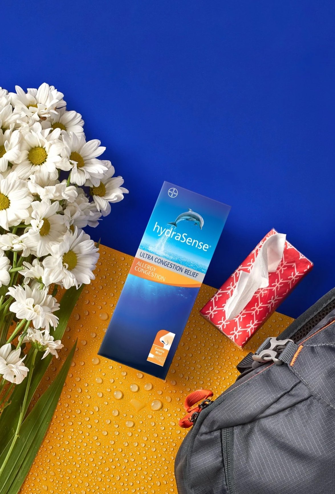
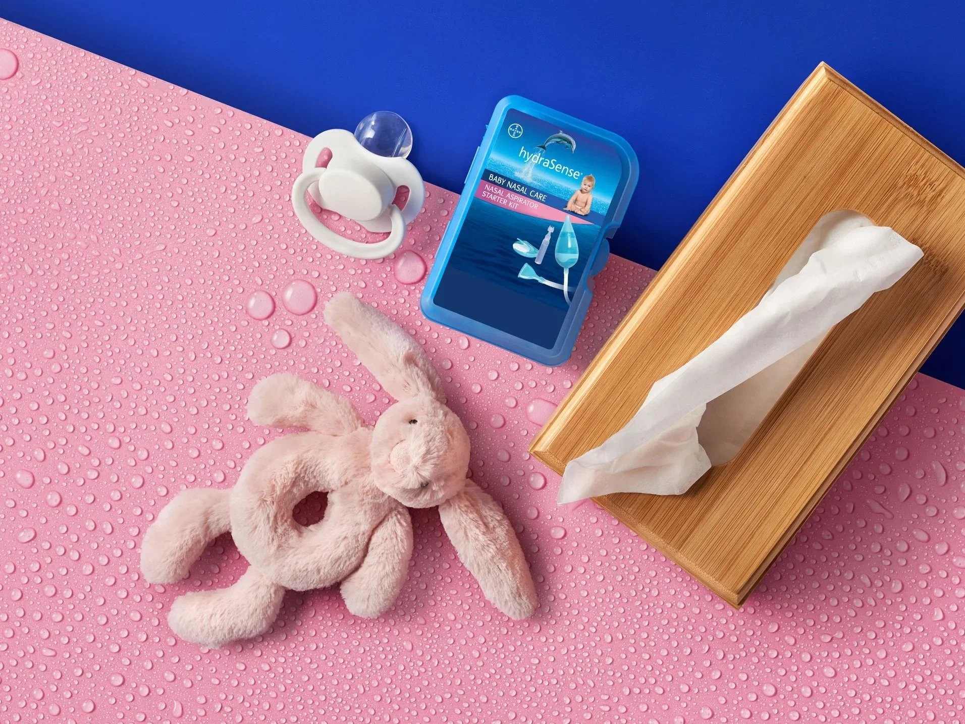
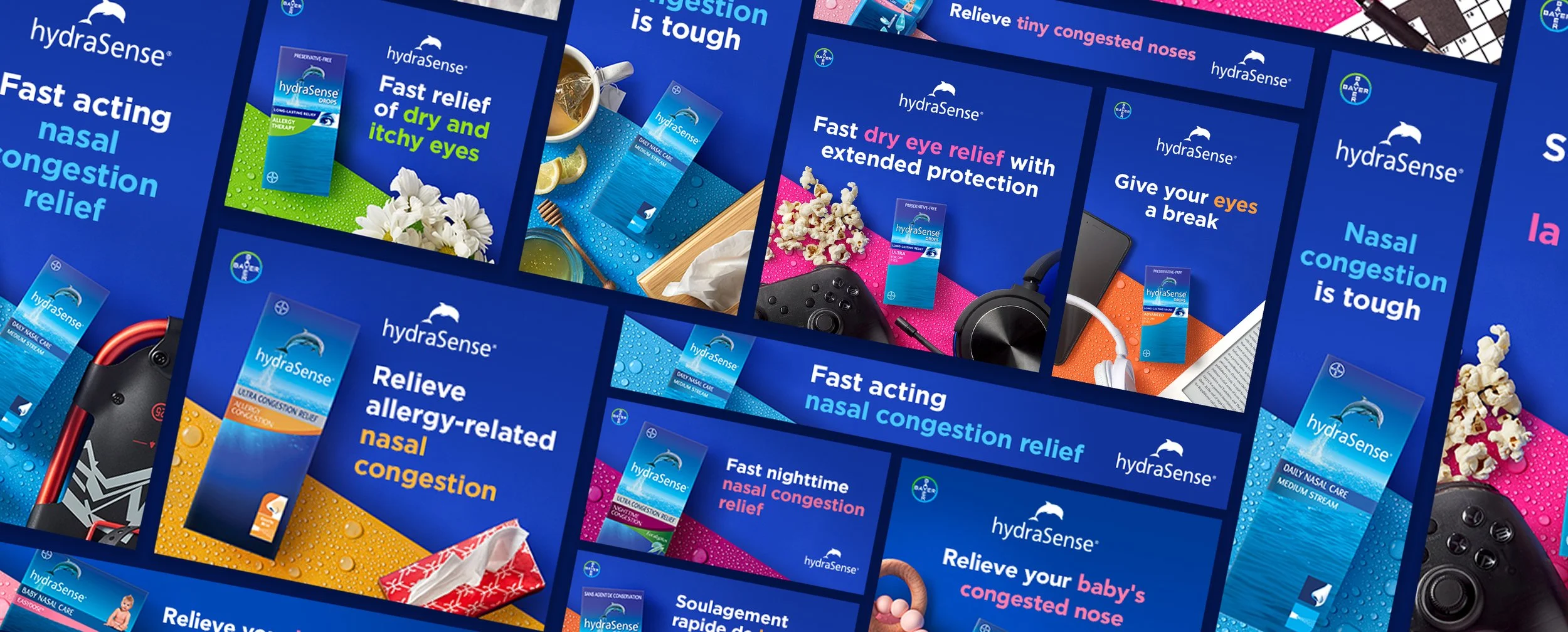
Inspired by the saline itself, we replaced sterile whites with layered, sea‑inspired textures, bold graphic treatments and tactile photography that nodded to scientific legitimacy without feeling cold. We developed a suite of high‑performing digital assets for each hydraSense SKU group, balancing distinct visual cues for each audience with a shared brand grammar. Assets included hero visuals, TVC development, product imagery and motion templates built to be modular and platform-ready. Following asset delivery, OLIVER was engaged to develop a comprehensive masterbrand design system: a branded, buildable, modern digital treatment set to ensure visual cohesion across all hydraSense SKUs.
The work provided hydraSense with a contemporary, flexible visual identity that preserves product science while improving shelf and screen presence. By creating distinct yet cohesive asset libraries and a repeatable design system, we positioned the brand for scalable, brand-forward activations across digital and retail touchpoints.